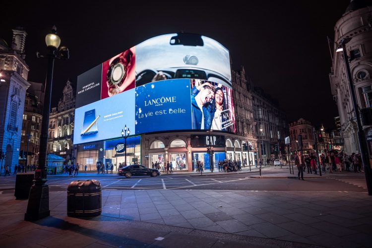
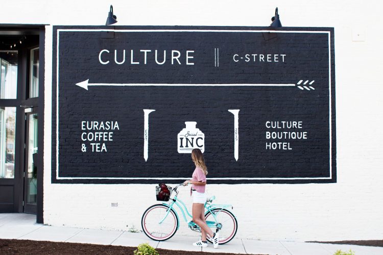
When designing for a large format, whether it be a banner stand, an exhibition backdrop or even on the side of a bus, it’s important to make a positive impact that engages your audience. However, getting the right balance of imagery, colours and fonts, coupled with the more technical aspects of designing for a large scale, can sometimes be a challenge. Here are some tips to ensure you get it right…
Know your space and audience
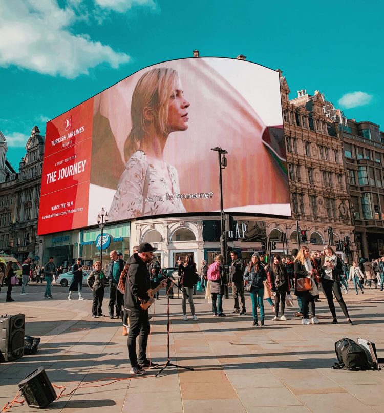
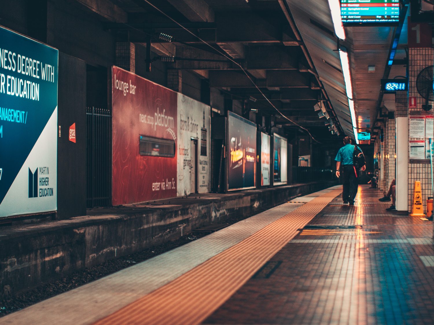
How can you create an eye-catching display if you don’t know whose eye it’s intending to catch, or where it will be positioned? It’s important to find out where your creative will be displayed and who your target audience is; will it be at an event for exhibition attendees to take notice, on a wall in a tube station to engage passing commuters, or perhaps in a bus stop drawing the eye of anyone who’s near?
It’s vital you know this, as it will help to determine the time the reader will have to take in the information presented. If at the side of a road for example, passing motorists would only have seconds to process the information. Research by Kinneir & Calvert when designing road signs, showed that motorists read the text presented by word recognition rather than registering each letter. This meant that they could read mixed case text much easier than capital letters, as they were more used to the shape of the words. You should take these things into consideration.
Choose the right image format
Where possible try to use vector imagery and text for large format design. Vector artwork will allow you to scale it up to any size without having an impact on the quality. This is because vector shapes, lines, and colours are defined by mathematical equations rather than being made up of individual pixels like bitmaps. This format also helps to keep file size to a minimum.
If using bitmaps, you need to be careful how large you scale up the imagery. Otherwise it could result in a jagged blocky look because of the individual pixels being enlarged past their intended size. You need to consider the viewing distance of your asset as this will determine the dots per inch (dpi) required. The closer it is to be viewed, the higher the dpi needs to be.
Design on a smaller scale
Some projects may require you to create HUGE designs that are physically impossible for you to create on a single canvas. This is because most programs have a limit to the size you can work with. A good approach would be to design at ¼ scale and have the printer scale it up to full size. This also means your design program should run faster, saving work will be quicker and the whole design process will be easier. It is also more likely that you will be able to test print at this smaller scale to double check the artwork before you finalise it. Just remember when using bitmap imagery to calculate the full-sized resolution to ensure the quality is sufficient.
Select your fonts carefully
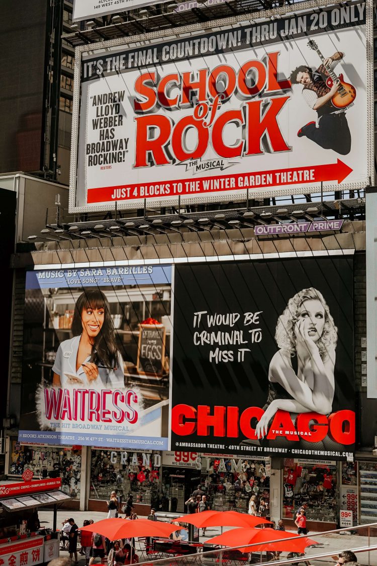
When creating large format designs, these are generally viewed from a distance. The most important factor in selecting a font is not just it’s style but it’s legibility from afar. A good rule of thumb is to stay away from using any elaborate fonts because script styles and serif fonts are usually more challenging to read. Some guidelines for font success are listed below:
- Avoid using thin or light fonts, where the lines blend into the background.
- Check the kerning of fonts, if letters are too close together it’s harder for people to distinguish between them. Alternatively, if the letters are too far apart it makes each word less obvious.
- Avoid paragraphs of text using block capitals as it’s harder to read quickly. Keep capitals to short sentences.
Think about contrast and copy length
It’s important to make sure that there is enough contrast between the creative elements in your design and the copy. You should make sure the text stands out from the background and is easy to read. Where possible, try to keep your copy to a minimum and only focus on high level messaging to get your point across quickly. If you feel you have more to say at an event for example, you could additionally hand out leaflets and flyers containing this extra information.
A picture paints 1000 words
Make sure the imagery chosen is clear and well- spaced. Try not to clutter your design with lots of different graphic styles that could be confusing to your audience. Simple line style graphics are easier to understand at a glance than more complicated ones. Using simple icons could also mean you reduce the amount of text needed and create more space. For example, an icon of a telephone could signify a ‘telephone number’ instead of having to include that text. Think of icons that are easily recognised and use these in your designs to engage with your audience. Having lots of space makes processing images easier, BUT it’s vital that you select engaging images that will draw the viewer in. Balance is key!
Let’s talk about colour
Generally, it’s good to keep the number of colours used in your design to a minimum. Using two or three colours consistently throughout your design helps the audience to navigate through it. An exception to this would be a movie poster where more colours may be required to create greater impact. No matter how many colours you use, these should all be CMYK or Pantone values that your printer can work with.
There are also various colour combination considerations that you should take into account. For example, reds and greens may not be easy to view in close proximity for people with colour blindness. The further away the colours are from each other on the colour wheel, the better!
Test it out!
Once you’ve completed your design test it out against the criteria in this checklist. View it up on screen and move back from your monitor. Does it still work? Ask work colleagues to have a look too to get another opinion. You could also test print a section of your design at full size to double check the quality of the imagery before sending to print. You only usually get one shot at printing a large format piece, testing is vital!
Large format design can seem a daunting process, but if you’ve worked your way through this checklist you can hit the ‘send to print’ button with ease, sit back and have a cuppa knowing your design will be a success!
