Our designers strive to stay at the forefront of their trade, always checking out the latest trends and developments in design, branding and UI. We asked them to pick their favourite branding projects this year and share some insight into what top brands are up to. From colour palettes and imagery to ad campaigns, rebrands and brand refreshes, check out these insightful articles – you could just find that little nugget to support your own branding efforts.

Victoria’s picks
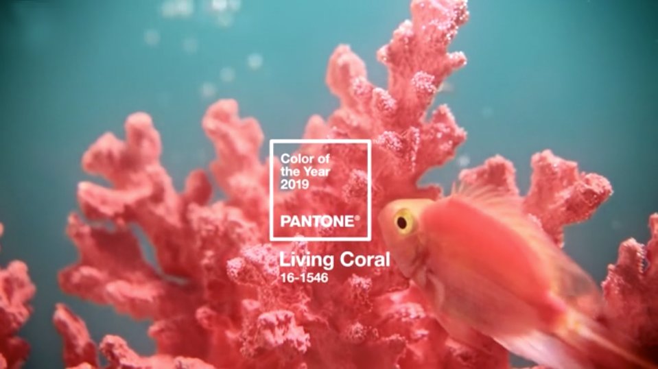
Pantone Color of the Year 2019: PANTONE 16-1546 Living Coral
When creating a brand, colour is an important factor. Each year The Pantone Color Institute release their ‘Pantone Color of the Year’ which can be a great starting point to base your colour decisions. Through careful consideration and trend analysis, Pantone’s colour experts assess colour influences across many sectors including the entertainment, fashion and travel industries. 2019 is the year of ‘Living Coral’, a vibrant yet mellow hue designed to ‘embrace us with warmth and nourishment’ and to ‘provide comfort and buoyancy in our continually shifting environment.’ Sounds good to me! I’m certainly adding it to my colour pallete this year!
Getty Images: The Meteoric Rise of Veganism
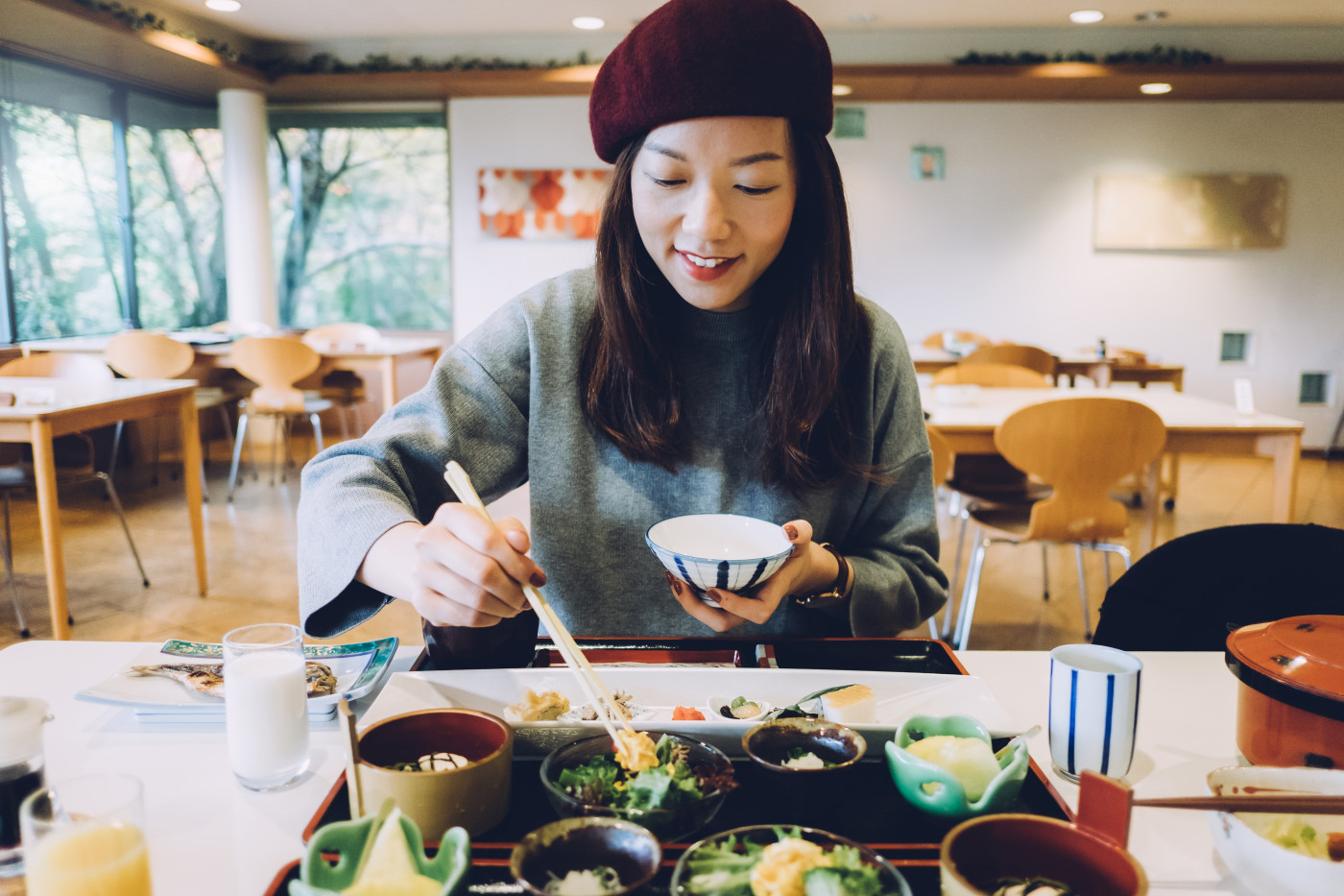
Along with choosing the right brand colours, image selection is an essential part of brand success. Using imagery that is current and on trend means you can engage more effectively with your audience and what is relevant to them.
For example, many people started the year with ‘veganuary’, living a vegan lifestyle for the whole of January. So, does this mean we’re likely to see lots of health inspired imagery in 2019? Kate Rourke from Getty Images certainly thinks so, along with visuals set to convey a wider awareness for the well-being of the planet. Veganism is certainly a hot topic and has been identified as a key microtrend for 2019.

Nick’s picks
Meet your shoes – Allbirds ad campaign
I first encountered this ad campaign via Spotify adverts, where they caught my attention in a place where you don’t really want to be bothered. With the advertising marketplace changing from TV and radio to video and streaming services, campaigns have to fight harder to capture your attention, with most brands – lets face it – missing the mark. Allbirds’ recent ad campaign by Anomaly Los Angeles avoids simply shouting louder than other ads, to spark curiosity through a hilarious and slightly surrealist campaign – also carried across a duo of video adverts.
The idea of ‘meeting your shoes’ sticks in your mind and fits perfectly with their brand voice and sustainable products: shoes made from trees, wool (and even sugar!) Brand agency Redantler say they built the brand around “curiosity and exploration” and that “each interaction with the brand invites people to join them on the journey”, which is instantly discerned from their flowing logotype (as well as the adverts’ wandering protagonists). This seems like a clear example of building a brand with room for humour and quirkiness to go along with a clearly-defined personality.
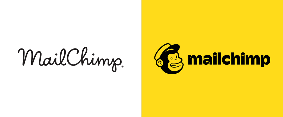
Mailchimp rebrand: a purposeful change
A rebrand can be one of the hardest things for a company to undergo, and it isn’t always obvious why change is needed – especially for beloved, successful brands (see Twitter furore over Slack’s recent logo change). Mailchimp, in collaboration with Collins, have sought to retain the lovable elements that endeared customers to Mailchimp as they expanded their product offering from simply an email marketing tool to a more comprehensive marketing platform. This meant keeping their well known ’Freddie’ logo mark. The new brand has attempted to balance their playful brand with a slight maturity – which is captured well by the statement “Growing up doesn’t have to mean buttoning up.” The naïve script logotype has been dropped; their new logo unites Freddie with a new chunky typeface, which although is still quirky – feels bolder and more important. An elegant but expressive illustration style helps further establish mailchimps more substantial, but still unique brand personality.
Tom’s picks
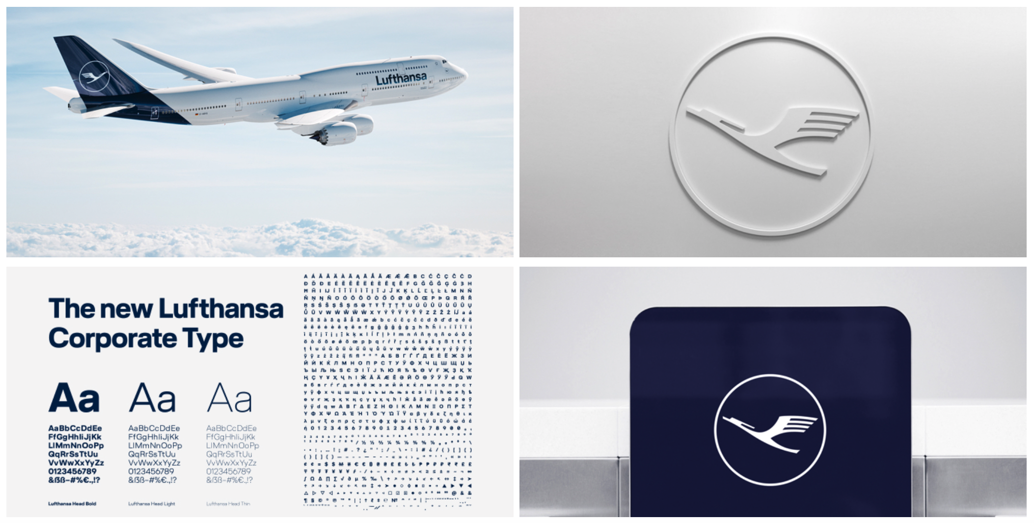
Demonstrating continuity: Lufthansa
There’s no need to throw the baby out with the bath water. If your brand has enough (and the correct) equity then you may just need to re-focus and re-fresh rather than re-brand.
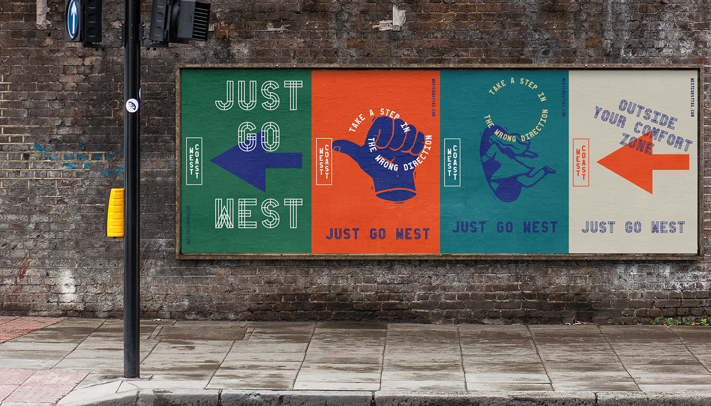
Achieving flexibility: West Coast Tasmania
Modern branding systems have to work hard. Online, offline, social media, OOH — there’s a lot of ground to cover. The trick is to be consistent but flexible. Be like the reed—bend but don’t break.
