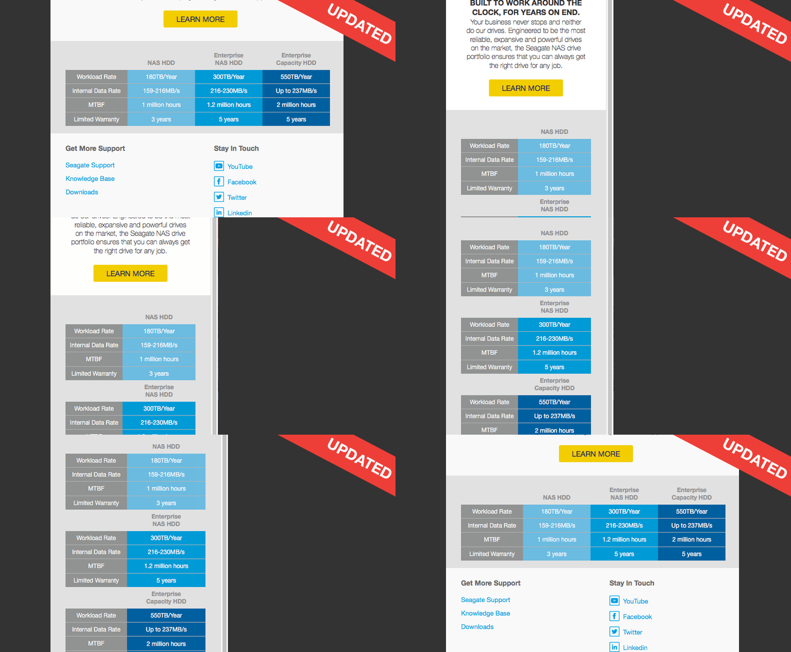
A few weeks ago we wrote a blog post about how to create data tables, within an email, that can be responsive. This meant that people could add data tables to an email, which often contain large amounts of data, and not worry that the email will become unreadable on mobile devices when trying to accommodate a data table.
The reaction to the post was mainly positive but there were a couple of questions about email client compatibility which we’re keen to answer.
We found that the data table didn’t hold up well in Gmail, specifically the Gmail app (to the surprise of no one…) so we needed to come up with a way of coding the table to work with the app whilst also keeping its responsive natural. A few tweaks were needed!
Gmail (App)
The mobile app for Gmail doesn’t support any CSS within style tags, including no media queries, so it’s important to create a data table that works with just inline styling in the event of CSS not being available. We therefore went down the route of building the data table to be the mobile version naturally. This will allow us to have a working version within the Gmail app which we can then modify with CSS, MSO coding and media queries to cater for the other clients.
Gmail (Desktop)
In order to hide elements for the desktop version of Gmail we can’t use standard CSS as this is not supported. Thankfully there is a different form of styling we can use to modify and hide elements in Gmail. This is achieved by utilising the lang property and can be understood in more detail by reading this article from the guys over at FreshInbox. Using this method we can hide the duplicate category titles and float all the products into one line.
Other
After making changes to the table to support Gmail we found that the other email clients fell nicely into line with only a small amount of CSS and MSO coding needed to achieve the same results as before.
With the tweaks done to the data table we set around testing it again on all the popular email clients and were pleased to see it rendering, as we wanted. We’ve set up a Litmus builder preview so that you can see how the table will render across a number of different email clients.
So there you have it, taking a mobile first approach did the trick, and we’re confident that the data table will look good in all popular email clients. Feel free to take the code and incorporate it into your own emails, we will be doing the same!