Print materials, such as brochures, folders and postcards, are a powerful way to support your marketing campaign strategy. But there are certain factors to consider which can further enhance their appeal, helping augment messaging, tone of voice, whilst taking into account the practical considerations such as size and ease of deliverability. Within this blog, I take a closer look at some of the specifics – so you can turn a mediocre piece of print into something truly impressive.
Stock, Coatings and Finishes
Small format print campaigns are all about getting your information into people’s hands, and carefully considered stock choices can create a great experience when they hold the print.
The first thing to consider is how light or heavy you should go (measured in grams per square metre). There will be discrepancies with different stock, but as a guide 100gsm – 150gsm provides a lightweight flyer and 150 gsm – 300gsm for a thicker paper or card. 350gsm and above provides a much thicker card, for example for use on business cards.
It’s also important to consider uncoated or coated paper such as matte, satin/silk or gloss. These days I generally avoid Gloss for most standard scenarios, as the heavy shine can appear cheaper and unconsidered – however, coatings can provide an extra sleekness to your print. You can also add gloss, silk or matte lamination after printing on coating paper. Discuss with your printer for guidance or request samples.
There are almost unlimited options for choosing your stock type (budget permitting), however, paper choices can have a big impact on how your print looks and feels. For elegant items such as invitations I particularly like Hammered or Linen paper, or Kraft paper for an old-fashioned feel. Paper suppliers such as G. S. Smith curate a range of coloured and textures papers to add excitement to a print project.
It’s important to consider printing limitations with stock types. Some papers may have high absorption if used uncoated. Coloured paper may affect the legibility or colour of the print, or require spot inks in the case of printing a light colour on a dark stock. Additionally, light or heavy stocks may not be able to pass through a printing press, so it’s always worth a discussion!
Bringing print to life, it’s all in the Fold
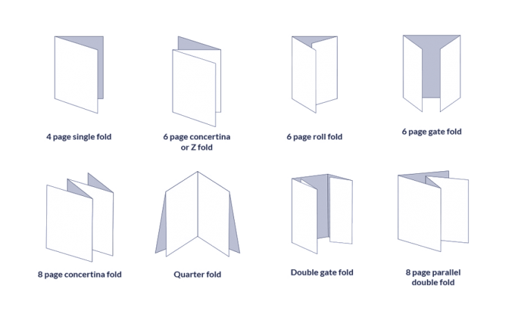
It’s easy to think of a print as a one-dimensional concept, but folds can bring paper into the 3D world to make it really come to life. Below are some examples of folds you could try:
- Tri-fold
- Z-fold
- Accordion
- Tent fold
- Gatefold
- Map fold
Packaging is another example of folds taking print to another level. There are many examples of creative packaging – and they can be used in marketing too. For example creating a unique leave-behind, desk-item or gift. Whilst printers may have some common templates, designers often work in partnership with them to create alternative folds or packaging nets.
Enhancing print with Spot Inks
You can achieve further effects with the use of spot colours or varnishes. This is the use of extra inks in your print, in addition to the standard print process (most printers use 4 channels of cyan, magenta, yellow and black). Pantone is the most well known manufacturer of these such inks, and choosing a Spot colour can be used to maintain the best colour reproduction across your print collateral. It can also be used to achieve colours outside of the gamut of CMYK printing.
Spot varnishes can also be used to provide the effect of a lamination, on certain parts of your print. This is done by printing using a clear varnish instead of an ink, and can make certain elements stand out with a shine.
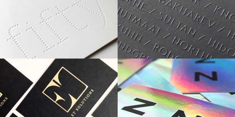
Creating that luxury finish – Foils & Embossing
Take your piece of print to the next level. Foils can be used to provide a range of different effects which other printing methods cannot. It is achieved by applying a thin sheet to the surface, which can be applied to areas of a design much like a spot colour. It is most commonly used to apply metallic effects, but patterned or matte foils can also be used.
Blind embossing or debossing, can be a great technique to apply to corporate stationery, invites or even packaging for that touch of class.
 Examples by Ben Wells
Boost engagement through digital
Recently there have been growing examples of print being integrated with digital functionality, to take things further than a simple QR code or AR (augmented reality). Creating a design that a camera can interact with via an app on a smart device is a great way to increase engagement with print. One example of positionally tracked AR is the Virtuali-Tee, where users can explore the human body by hovering their phone over the app.
 Curiscope’s Virtuali-Tee
Other techniques include:
- Gilt edging
- Die-cutting
- Letterpress
- Edge painting
There are many more areas of consideration, depending on the project – however the above are the most relevant to the majority of projects, and should provide a good starting point when thinking about carrying out your campaign using print.
Visit our Print services page
