Icons are very much part of our digital furniture – in the living room of the world wide web – vital for the function and understanding of websites, apps, programs as well as analogue implementations such as signage and way-finding. The word icon is defined in computing as “a symbol or graphic representation on a screen of a program, option, or window.” Simply, the function of an icon is to communicate a concept clearly and quickly. Research has shown that the brain processes visuals 60,000 times faster than text, so it’s easy to see how it would be beneficial to use icons in these wide ranging circumstances.
From the Xerox Star to Google Material Design, Icons have evolved in their appearance as well as their importance. So what makes a good icon? Primarily the illustration of the icon should achieve it’s goal of communication as quickly as possible, generally utilising universally understood symbolism and an effective design style, which might be different in different contexts. Additionally an icon style can augment the look-and-feel or personality of a brand, UI or the design system that it is a part of.
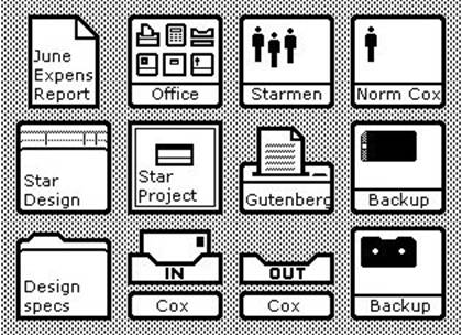
Icons from the Xerox Star’s operating system. Image credit: DigiBarn
History Lesson – Iconography Trends
The Xerox 8010 Star (1981), which utilised the first commercial Graphic User Interface (GUI), featured monochromatic pictograms, presented in a simple and consistent style. With the Apple Macintosh 1.0 (1984), Susan Kare formed what would become the foundation of Apple’s icon design language.
“I believe that good icons are more akin to road signs rather than illustrations, and ideally should present an idea in a clear, concise, and memorable way. I try to optimise for clarity and simplicity even as palette and resolution options have increased. I rely on common sense.”
Susan Kare
The first icons considered to be skeuomorphic were developed for NeXTSTEP, founded by Steve Jobs. Skeumorphism is an approach to design where interface objects (such as icons) mimic their real-world counterparts. Over time technological advances allowed for more realistic icons, but the principle remains the same. Examples include Apple Notes and Google Maps, which mimic paper notepads and maps respectively.
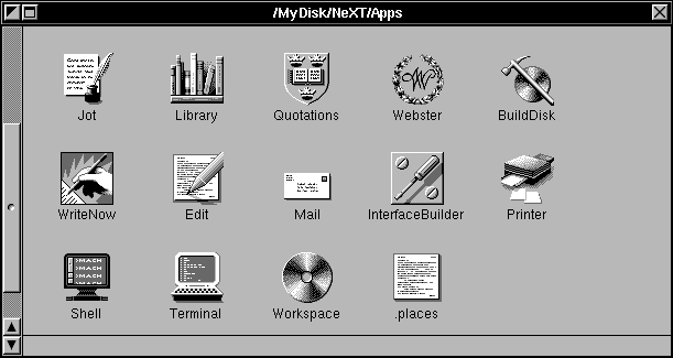
Icons from the NeXTSTEP 0.8’s operating system. Image credit: toastytech
The trend for flat design came to the fore in the 2010s, and Microsoft’s Windows 8 OS helped to popularise this in mainstream digital spaces. Icons are reduced to their minimal forms which led to a clear and readable interface, even at small sizes. The principles of 1960s and 70s minimalism are at the core of flat design, removing any excessive components or features of a product, painting or subject so that it communicates it’s message in the purest form possible, rejecting the principles of previously favoured abstract expressionism. In terms of icons, flat design was a reaction to the realistic icon style – often using heavy handed shadows and over-complicated graphics – which has now become dated and unfashionable.
An evolution of this trend, referred to as flat design 2.0 has been popularised with Google’s latest material design principles. This utilised a design style that is mostly flat, but includes subtle details such as shadows, highlights to imply further depth. Flat 2.0 can also be used in conjunction with purely flat icons to help users interpret visual hierarchies, such as differentiating a product with an action button.
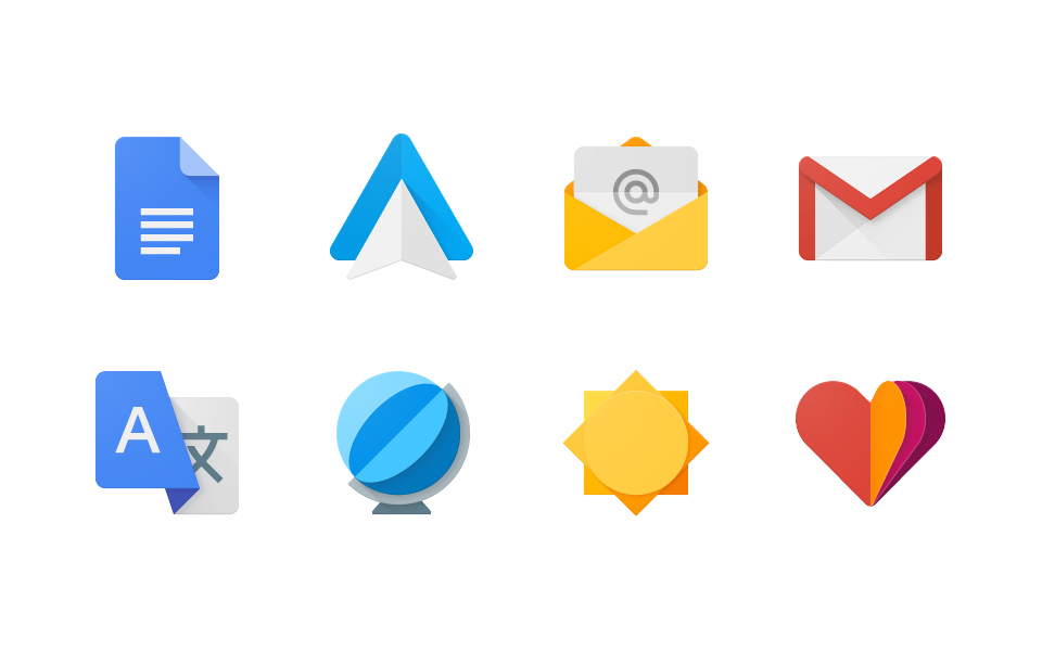
Icons from Google’s Material Design system. Image credit: Graphis/The Rivalry
Icon ticklist
Different icon styles may be suitable for use with different brands, or contexts, here is a starting point.
Consistent
Icons should be consistent in style throughout their implementation, eg. Website, UI.
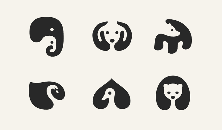
Negative space animal icons by George Bokhua
Clear
Choice of icon visual should be easily understood, and the style should allow for readability. If there are any doubts as to an icon’s meaning, such as with less familiar contexts or situations with many different icons, text can also be used to avoid confusion.
Universal
The concept of each icon should be able to be understood by the entire audience, it’s important to think of differing points of view across culture, industry and demographic.
Enhance
An interesting or unique style can enhance the user experience or aesthetic of a website or UI, and bring to life a brand.
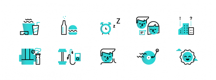
Duotone icons by Dmitri Litvinov
Navigate
Icons can play an important part in navigation, commonly used in UIs, and websites. Use on website navigation should be used with caution however, as navigation bars can easily become cluttered.
Decoration
Nice looking or interesting icons can help present information in a visually appealing way.

Playful icons by Yorlmar-Campos
Entertaining
Icons can be used to help put across the personality of the brand, which may allow them to be entertaining or humourous. Animated GIFs can be used to increase this. A favourite example of mine are the Mailchimp icons, which capture the tone of the brand and create a memorable visual style, strongly referring to their logo.


Animated icons for Mailchimp by Brent Clouse
We’ve come a long way since the 1980’s and the days of the Xerox Star, but principles have remained – if evolved in importance. In summary, icons should be clear and communicate quickly. They can also add richness to a brand’s personality and are important elements of any design system.
Visit our Illustration and Iconography services page
