Over the last few blog posts we’ve been on the hype train for interactive emails. We definitely think it’s the future of email and there’s already a lot you can do with it. We’ve talked about how to make an email interactive as well as explore the creativity side of it with our gaming email example. This time we wanted to create something a bit more commercial friendly that a client could use. This is where ‘The Email Shop’ comes in.
The Email Shop is an interactive email, which incorporates interactive elements to create a shopping like experience within an email. Whilst this concept is nothing new we’ve wanted to build something like this for a while and are keen to share the results. Before we delve deeper into the template feel free to take a look at the finished article (There’s a lot of code to dive into).
What Does The Email Do?
So now that you’ve looked at the code you’re probably wondering what the email does. Well this can be explained below.
The email allows the reader to select what product they want to buy, along with some styling options, before allowing them to add the product to their cart. They can then be directed to a webpage to complete the transaction.
It’s important to note that an interactive email can’t replicate all the steps regarding buying a product, as the support is simply not available on most email clients. This is the reason why the redirect to a webpage is needed.
How Does It Work?
In order to explain how the email works it’s probably best to show visually each step. As mentioned in previous posts on interactive emails the use of checkboxes is needed to hide and show sections of the email depending on the interaction. This email has no less than 48 checkboxes!
The reason for this many interactions in the email are because you need to account for every scenario the reader could go down when selecting and styling their product. Webpages can use JavaScript and other scripts to manipulate the product styling, therefore bypassing the need to have several variants of the same product on one page. Emails however don’t have this luxury, as there is not support for scripts in email, therefore requiring the manual inclusion of every product variant.
We can break down how each variant is placed within the template with a nice flow chart. It will display a small part of the process in our email template –
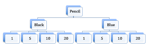
As you can see by just having two options when it comes to your choice in pencils you need to have 10 checkboxes. This is because you need a checkbox to select either Black or Blue and then 4 checkboxes for each colour to select what quantity you want. If you apply this logic to all the colour options we have in our email you can see where all the checkboxes have come from
Although having this many pieces in one email can seem daunting all your doing essentially is displaying one table depending on what colour you’ve selected and then again for the quantity you’ve selected.
Now that we’ve explained how the email works let’s dive into the coding to see what CSS relates to what sections of the email.
The Code
As mentioned before the interactivity in the email is actually very basic to the point where you are just turning elements on or off depending on what the user selects. However, it’s important to discuss what is being turned on or off when the email is clicked. To do this let’s break down the email into the three steps of the email – picking a colour, picking a quantity and adding the product to the cart.
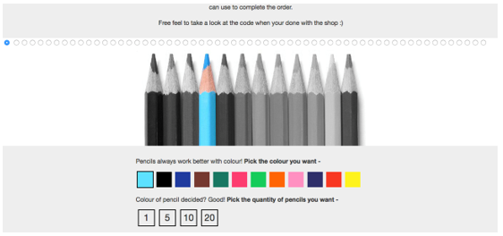
When you first see the email you’ll be greeted with just the colour choices. This is the first state of the email and has everything turned off. We do this by adding display:none to every interactive element in the email.
When you click a colour you will activate the quantity selection of that colour. This is done by adding a style of display:table, using a CSS rule linked to the checking of the correct radio button, to the quantity table. This displays the next step of the email which is the quantity selection.
The CSS rule will override the display:none, which is placed to hide the table, making the table visible to the user. Below is a snippet of code which shows you how the code looks when the Green colour has been clicked along with the CSS rule for it –
/* The CSS rule to activate the quantity of Green */
#Green:checked ~ table .quantity-green {
display: table !important
}
/* The label of Green */
<label style=”display:block; height:40px; width:40px; background-color:#20ca60; border: 2px solid #EEEEEE” for="Green" class="Green">
/* The quantity table for Green */
<table cellpadding="0" cellspacing="0" width="220" align="left" class="quantity-green" style="display:none; color: #333333; font-family: 'Helvetica Neue', Helvetica, Arial, Tahoma, sans-serif">…</table>
As you can see the CSS rule isn’t changing the inline styling for the quantity table but instead adding a new display style, which thanks to the use of !important, overrides the display:none. This process is then repeated for the next step, picking the quantity.
Below is the code which is used to activate the last step in the email, adding the product to the cart. We used the quantity of 10 as an example –
/* The CSS rule to activate the quantity of Green */
#green-ten:checked ~ table span.green-ten-total {
display: table !important
}
/* The label of Green */
<label style="display:block; height:40px; line-height:40px; width:40px; border: 2px solid #000000; font-size:24px" for="green-ten" class="green-ten">
/* Add to cart section for 10 Green pencils */
<span class="green-ten-total" style="display:none">…</span>
The code structure remains the same because you want the same results as the previous step. We’ll now move onto the last section, adding the product to the cart.
The ’Add To Cart’ button is the final step of the email and takes the user’s product selection from the email to a cart on the webpage. With scripts not working in email, due to lack of email client support, standard links have to be used to create the add to cart process in the email. The links that are used are exactly the same as the ones cart on the product’s website. This is because your looking to create the same procedure, therefore needing the same link.
Adding these links to the email is a simple process and below is a section of coding within our template where the links are placed. The interaction to display this button is the same as the other steps –
<a class="white" style="text-decoration: none; color: #333333; display: inline-block; border-top: 5px solid #fdf13d; border-bottom: 5px solid #fdf13d; border-right: 25px solid #fdf13d; border-left: 25px solid #fdf13d;" href="tba" target="_blank">Add To Cart</a>
You can see that the coding for the template is relatively simple and we hope by taking what’s been discussed in this post you can create something similar for your templates.
So why use it?
The big question regarding the email and indeed any interactive email is “why should we use an interactive email when a standard email works just fine for us?” From a personal view point, I guess the answer is that it improves the customer experience with your emails and allows you to build a picture of how that customer shops. This will hopefully aid your own marketing strategy for future email sends as you can tailor the emails to their spending habits, generating hopefully more sales.
Consider that by placing the majority of a shopping process into an email instead of a website you’re also streamlining the buying event for a reader as they no longer have to jump from website to email. Having every option to buy a product in the email means the whole buying process is quicker, therefore securing a higher chance of someone buying something from your company. This is especially the case in today’s society where people are constantly on the go and are looking to save as much time as possible on everyday tasks such as buying general goods or products.
Conclusion
Over the course of this blog post we’ve detailed our latest email experiment and have shown how it works. We hope it inspires you to create something interactive in your own emails.
There’s a lot of reasons why we think an interactive shopping email can work in today’s society as stated in this blog post and past posts. We look forward with anticipation to seeing interesting, interactive, ecommerce emails appear. As for our interactive emails, well keep an eye on your inboxes..
