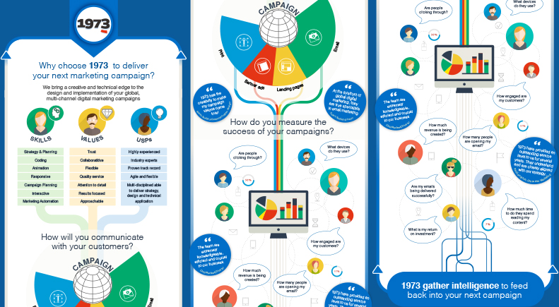

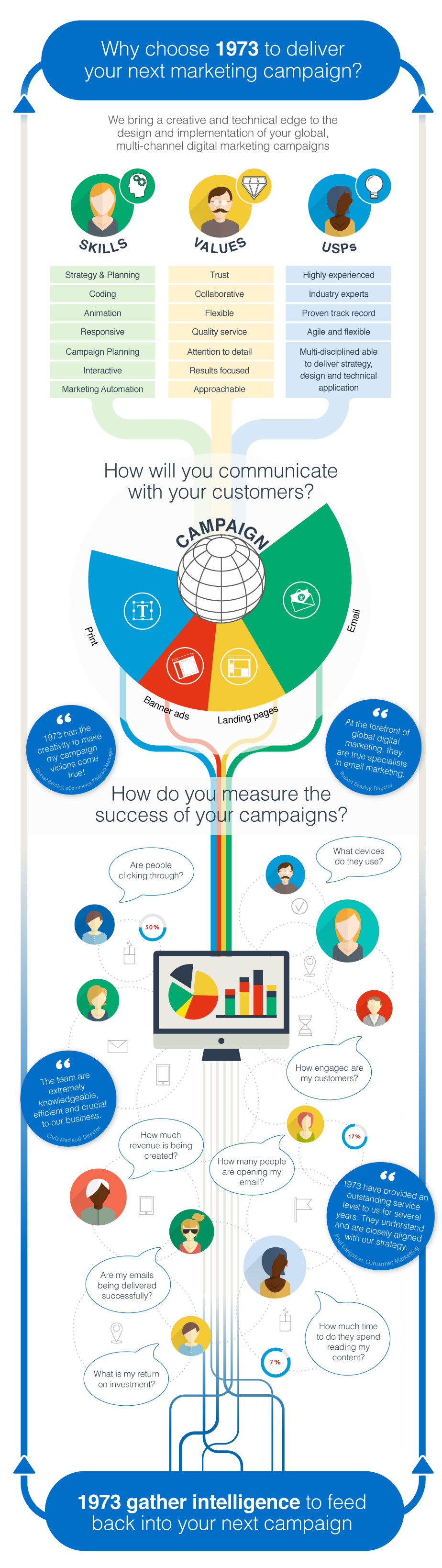
A big thank you to our guest blogger Justin Treharne, owner of ajust, for not only providing guidance on developing and designing infographics, but for creating such a fantastic example to tell our story – see below.

Where to Start
I always find it useful to have design mechanisms/elements that you can hang your journey off, this helps with the flow of the infographic and will also help the viewer follow your thoughts. Keep things simple, use diagrams and graphics to aid the visual esthetics, whilst making sure that the words have their own clear space for reading.

Colour Choice
This is dependent on the client and doesn’t always mean you have to have a multi coloured design to show the visual content. 2 colours will work just as well if using contrasting colours, this just depends on where you’re heading with diagrams and icons. The main thing is to keep consistency with your palette.

Size Considerations
The height is obviously governed by the content and doesn’t always have to be portrait, why not landscape? Think of the end platform for the infographic and how it can be used across social media, print, blogs or presentations. I find that creating the width at a minimum of 800px to start with helps and only increasing to a maximum of 1100px if required. It’s worth noting that these infographics can be viewed via smart phones and this should be part of your design considerations.

And Remember!
Great content can be shared, make sure the end format can be shareable via social media, include a clear call to action or contact information so the viewer can engage with you, this will increase awareness of your brand and show your expert knowledge.
Need help with your marketing communications? Call us on +44 (0)1491 613 732 or drop us an email and we’ll be happy to explore what we can bring to your business.
