
Adding the third dimension to interactive email

Using 3D CSS transforms in email to showcase a special product launch.
This email formed part of a D2C campaign for Seagate Technology in North America, centered around the launch of an officially licensed product featuring character artwork from Genshin Impact, a very popular anime-style action role-playing game.


What 1973 did?
Underneath the dual-branded headline, a rendered 3D model of the product appears on top of a full width background image. A pulsing cursor icon encourages the user to click and watch the product rotate in order to see all the way round the drive.
On mobile the drive is scaled down and the arrow icon switches to a hand icon. The drive rotates a quarter turn on each click/tap, and each ‘frame’ also includes a text box that describes key features of the product.
Further down, the email also includes a carousel as a second interactive element, with additional imagery, text and buttons.


Why did we do this?
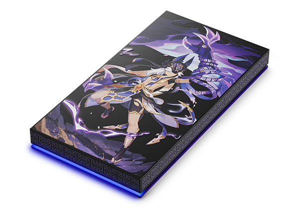
We felt that Seagate’s launch of this very limited edition and eye-catching hard drive deserved something a little more special and out of the ordinary. Unusually, the product features colourful imagery on all sides of the casing, and the assets we had available included static shots of the drive from all six orientations. This gave us the idea of using those images to recreate the drive in 3D.
Similar licensed products (featuring characters from Star Wars, Spiderman and Black Panther) had included imagery on the reverse of the drives, and we had used this in earlier emails with hover states to show off both the front and back of the products.
From our device rendering research of previous D2C sends we knew a large enough percentage of users were opening on Apple devices which would support 3D CSS transforms, but that we would also have to provide a fallback option as well. This became an animated gif of the product turning to give all recipients a similar effect on those email clients not able to display the interactive 3D elements.
How did we do this?
After creating a simple cube in 3D, the first job was some retouching of the flat images to scale them correctly against each other and produce a set of PNGs, one for each face of the cube. Then we could resize the cube to the correct proportions that we needed and apply each image as a background to the respective div.
Using the checkbox hack with a set of input tags means we can chain together a series of cubes and animations, one after the other, each contained inside the label tags for the corresponding checkbox. Each @keyframes animation contains a transform: rotateY() of 90 degrees, starting at -30 going to -120, then -120 to -210, -210 to -300, and finally -300 to -390.
There is also a separate set of animations for each accompanying text block to fade in.
Benefits of this technique?
- The interactivity is new and different
- It creates a wow factor and intrigue for the user
- It reduces the file size of an equivalent video type piece of content
- Any box shaped content could be used for other executions
In Conclusion
This was a challenging email to build, but one that 1973 are incredibly proud of. Please chat to us to see if we can add something different to your email audience.
