With email and automation being our primary specialism, we have designed, built and deployed thousands of emails for our clients. Over the years, this practical application has enabled us to gain a wealth of experience and build a sound knowledge base of what works and what doesn’t and we’d like to share our top email design tips to take yours from good too great.
1. Branding
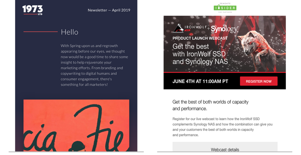
Ensure your email is branded accordingly to make it really clear who’s sending the message. Hearing horror stories of people engaging with email scams, audiences can be cautious of opening/interacting with an email if they aren’t sure who it is from. Make sure your logo is prominent in the design to gain trust. In the examples below, the logos are shown at the top of the emails.

2. Memorable messaging
Make sure there is a cohesive story between the subject line, header and content. Each of them should provide just a little more info than the previous item. Limit your message to no more than three different topics, so that you don’t overload your audience. A concise message that’s straight to the point will be more memorable. If you have a lot to say, you can include a link to a specifically designed landing page to display this content.
3. Responsive layouts
It’s important that your design works on multiple devices. Many people now view their emails on mobile and tablet display so your design needs to work for all screen sizes. Think about how you order the content on a desktop design, so it can easily be stacked on a mobile view. A handy tip is to use an underlying grid/columns to create your responsive layouts.
Remember emails are not webpages, so you can’t position things anywhere you like. For example, wrapping text around objects is a no no, and also using strange shapes, angles and curves. This is because these examples can’t easily respond for different displays. In short, the more display widths you consider the better. Here are some size guidelines to help you:
As a minimum you should design for the following widths:
- Desktop display – 600px
- Mobile display – 320px
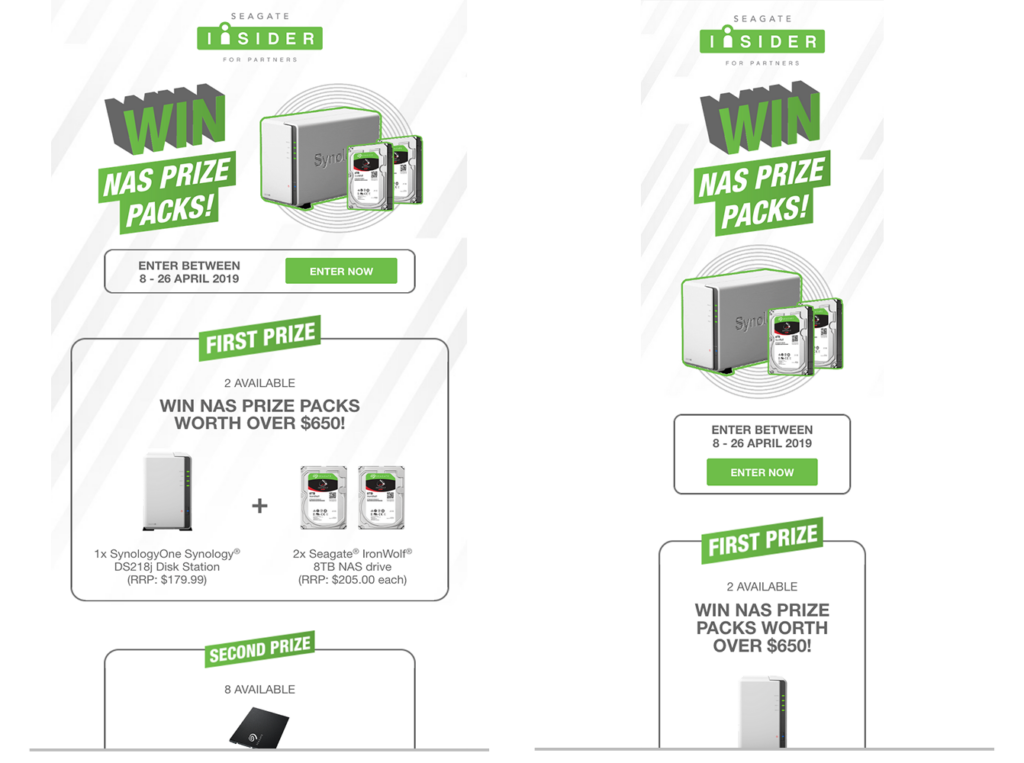
In the example below, you can see how a two column layout for desktop (on the left) responds into a one column layout for mobile (on the right):

4. Impactful hero imagery
Choose your imagery carefully to ensure it visually conveys the main point of your message. Using large photography can help customers to engage with your products, despite not being able to interact with them in real life. This results in them being more likely to make a purchase.

5. Make space
Nobody likes clutter, a jam-packed email design with too many columns and images, or too much text, can be off putting to a recipient. It’s no longer vital that all content appears within the email client window, as audiences are now used to scrolling. This means that you can space out your content into easily digestible sections that are much more appealing to the eye.
6. Clear call-to-actions
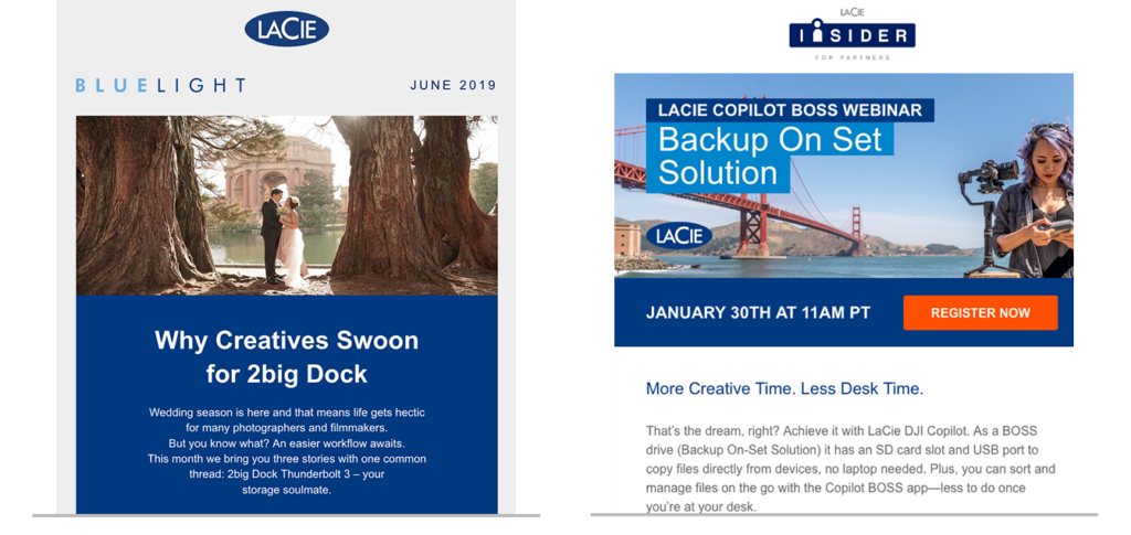
Make sure your call-to-actions (CTAs) stand out and look clickable. Placing them at the top of an email is a good idea, so that they are immediately seen. Use a bold colour that differs from your body copy to highlight your CTAs. Placing them in a button design makes them easily identifiable. The examples shown below illustrate how a bold colour choice can draw the eye to your CTAs.

7. Fallback options for images and fonts
Many email clients will block images, so your design should work without these. Avoid embedding copy in images, or back them up with meaningful alt-tags, which will display when the images are turned off. Use a coloured background instead of an image to create a more interesting design for those people who can’t see the imagery.
Similarly, not all email clients can display web-embedded fonts so ensure you have a fallback option; Arial, Verdana or Georgia for example are good options.
If all else fails, ensure you include a link to view the email in a browser so that recipients who can’t view your email correctly in their email client aren’t forgotten.
8. Animation
Using animation is a great way to catch the attention of your audience. This could be in the form of a gif or CSS animation. When including gifs, you must keep the file size on these to a minimum. If an animation is larger than 2MB it’s probably not a good idea to include it. This is because it will affect the time taken for your email to load. If content isn’t immediately available, your recipient will more than likely get bored and move onto something else.
Another factor is that not all email clients can display gif files or CSS animation. You should ensure you have a suitable fallback image for these clients that represents your animation. In some cases, the first screen of a gif animation is displayed, so check that this is suitable (and not a blank screen).
Email design summary
There are so many things to consider for a successful email campaign. The best way to learn, as we have found, is by trying things out and seeing what works. Split testing email designs is a great way to gain insight into their effectiveness. Does button colour effect the click-rate? Will a gif animation get more hits? Each audience is different, but we hope that the areas we’ve covered in this blog will help you get started in the right direction!

