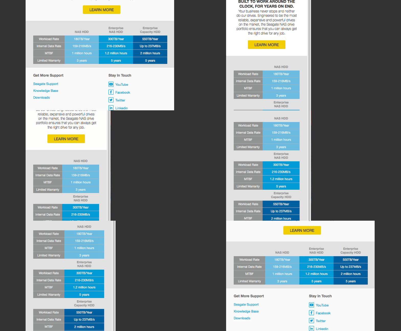
Mobiles are fast becoming the primary device on which to read emails. According to Litmus 3 of the top 5 email clients on which emails are read on are of mobile origin so it’s important that your emails look good on these devices. For the most part this is achieved but one problem area we’ve found is how to display big tables of data in a way that’s both desktop and mobile friendly.
We’ve gone through a few different ways of achieving the look we want but nothing we tried felt responsive enough. Therefore we went back to the drawing board and thought about the way we built emails. We decided that by incorporating some of the components, which make ‘spongy’ emails we might be able to achieve what we want. After some trial and error we were able to get an email working with the big table of data responding how we wanted.
In this blog post we’ll share the coding behind the finished product and why we decided to code the way we did. Before we jump into the deep end of code it’s first worth showing what the example looks like from a visual point of view –
Desktop Version

Mobile Version

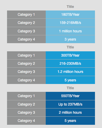
As you can see the desktop version of the table displays as a 4×5 table which when viewed on a mobile device scales down to a 2×15 table. The process of creating this table requires several parts of coding as to retain the look we want in all the major email clients and this is what we will discuss next.
Mobile Clients
Coding the table to look good when viewed by mobile devices and in particular iOS devices was the main aim of this exercise. This was achieved in two major ways – the use of percentage widths and CSS.
Each of the 4 columns is a table with a percentage width of 25% and a left align property. This allows the tables to fit nicely into the table cell we are using as the container and provides the appearance of one big table for the desktop version of the email. Using percentage widths also allows the template to retain its ‘spongy’ structure, which means the email can be scaled down, and still keep the same appearance. The rest of the tables are coded as normal with inline styling to match your design.
Within these 4 tables are two hidden tables, nested between columns 2&3 and 3&4, which will act as the category section on mobile devices. These are hidden by the use of 0% width on the table and font-size:0px to hide the text within them. Activating these tables requires the use of CSS and also the use of media queries.
The use of CSS is actually very minimal here and we only need to use it for two things. The first thing is to turn on the hidden tables to display the extra category tables. This can be done by adding width and font-size to the tables as seen below –
table[class="table40"] {width: 44% !important; font-size: 12px !important}
The second thing is to adjust the widths of the tables to get them to fall into two columns. This is done with the addition of a line of CSS as seen below –
table[class="table60"] {width: 56% !important;}
It’s important to add the table60 class to the content tables and table40 to the category tables as this will keep the two-column structure you want. As we are using the percentage widths for our tables the template will keep it’s ‘spongy’ structure and therefore will fill every screen size nicely.
Webmail Clients – Gmail
Webmail clients generally display the table, as we wanted with the hidden tables causing the most problems. Standard procedure when hiding content is to add a style of display:none. This will hide the content until needed and works fine in most web mail clients except for Gmail. The reason for this is that Gmail doesn’t accept the display:none style and will therefore display the hidden tables we want.. well hidden!
Adding an !important on the end of display:none will work in Gmail but then will override the CSS we have implemented for mobile clients, causing the tables to not appear.
We already alluded to it previously in this blog post but the best way to solve this issue is to instead go down the 0px font-size and 0% width. This will cause the webmail clients to display the HTML, but due to both properties being 0, will not visually show it. The tables can then be activated by CSS for mobile clients.
Outlook
The one email client who caused us the most problems is unsurprisingly Outlook. With it’s lack of support for CSS and the complications when placing tables side by side in one table cell it’s clear we needed to set up the table differently to satisfy this prehistoric client. Luckily we can do this with the use of mso coding. Outlook also doesn’t support the responsive state of our email so we can just focus our energy on getting the desktop version working correctly.
As mentioned before Outlook doesn’t like tables side by side as in the example we’re using. This is due to the fact that by default Outlook adds padding to the edges of tables, therefore creating additional width to the tables, which knocks the overall width over 100% and will cause the tables to stack vertically. To combat this you have to create a table with a table cell for each column that will then remove the padding and keep everything nicely lined up. This is achieved with mso coding and looks something like the below –
<td>

Category Table

<!--[if mso]></td><td><![endif]-->

Content Table 1

<!--[if mso]></td><td style=”display:none”><![endif]-->

Hidden Table

<!--[if mso]></td><td><![endif]-->

Content Table 2

<!--[if mso]></td><td style=”display:none”><![endif]-->

Hidden Table

<!--[if mso]></td><td><![endif]-->

Content Table 3

</td>
As you can see outlook will create a table cell that will contain each column of our table. Adding display:none to the cells with the hidden tables will hide them in Outlook so we don’t need to worry about any table styling.
We’ve solved the padding issue but another issue now persists in that all the tables are squashed within their table cells. This is because the percentage width is now responding to the individual table cell rather than the overall container cell. To solve this issue we need to create a duplicate column just for outlook. Again we can achieve this by the use of mso coding. Below is the code structure for our new duplicate columns –
<table width="23%" border="0" cellspacing="0" cellpadding="6" align="left" bgcolor="#919292" style="font-size: 12px; font-family: 'Helvetica Neue', Helvetica, Arial, Tahoma, sans-serif; color:#ffffff; mso-hide:all" class="table40">

	<tbody>

		<tr>

			<td bgcolor="#e1e1e1" align="center" style="color:#e1e1e1"></td>
		</tr>

		<tr>

			<td align="center" style="border-bottom: 1px solid #b4b4b4;color:#FFFFFF"> Category 1 </td>

		</tr>

		<tr>

			<td align="center" style="border-bottom: 1px solid #b4b4b4;color:#FFFFFF"> Category 2 </td>

		</tr>

		<tr>

			<td align="center" style="border-bottom: 1px solid #b4b4b4;color:#FFFFFF"> Category 3 </td>

		</tr>

		<tr>

			<td align="center" style="color:#FFFFFF">Category 4</td>

		</tr>

	</tbody>

</table>
<!--[if mso]-->
<table width="100%" border="0" cellspacing="0" cellpadding="6" align="left" bgcolor="#919292" style="font-size: 12px; font-family: 'Helvetica Neue', Helvetica, Arial, Tahoma, sans-serif; color:#ffffff" class="table40">
<tbody>
<tr>
<td bgcolor="#e1e1e1" align="center" style="color:#e1e1e1"></td>
</tr>
<tr>
<td align="center" style="border-bottom: 1px solid #b4b4b4">Category 1</td>
</tr>
<tr>
<td align="center" style="border-bottom: 1px solid #b4b4b4">Category 2</td>
</tr>
<tr>
<td align="center" style="border-bottom: 1px solid #b4b4b4">Category 3</td>
</tr>
<tr>
<td align="center">Category 4</td>
</tr>
</tbody>
</table>
<![endif]-->
The two columns are basically identical apart from two differences. The first difference is that our old, non-outlook column has a style property of mso-hide:all. This basically works like display:none but is outlook specific meaning that the table won’t be hidden in any other email client. The second difference is that the new column has a width percentage of 100%. This basically means the table and content will fill the whole table cell instead of a small section as it was previously.
Conclusion
Whilst there is nothing particularly game changing about what we’ve done with the tables you can see how much of a visual difference there is and that’s the important thing especially when dealing with smaller and smaller screen sizes.
Responsive emails are the future, and to some extent the present, so it’s important that your emails are made with this in mind. We hope that our table example can aid you in your own builds in the future and if you wish to look at the entire code of the table you can via this link. After all with great emails come great challenges.