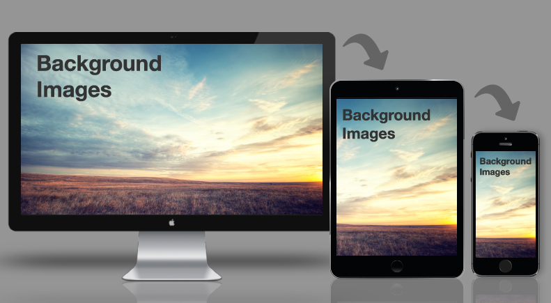
It’s been just over a month since the Email Design Conference in London and we’ve had chance to implement some of our learnings into our emails. One particular area of email development we learnt a lot about from the conference and have a big interest in is background images. We’ve already written a couple of blog posts on background images (which you can find here and here) but with our new found knowledge we wanted to write an updated post on how to use them effectively.
A big influence for this blog post is Kristian Robinson whose talk at the Litmus Design Conference gave us some great tips on background images and how to better use them in emails.
Use Background Images Only as a Complement
As anyone who’s dealt with email knows, incorporating background images into an email can be tough. Whether it’s the minimal support from Outlook or the strange ways Gmail renders background images in their app, so when you get one to work it’s tempting to make it a focal part of the email.
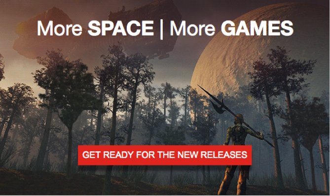
However, at the conference it was suggested that using background images to complement the text and images within your email rather than as a focal point of the email dramatically improves the overall success of the email. An example of this can be found with these two email hero areas which we’ve called ‘before’ and ‘after’ (meaning before and after the Litmus conference learnings) –
Before Conference:

After Conference:

As you can see the background image in the ‘before’ email is a bigger, more detailed image but can be distracting when trying to view the title and CTA which you want the focus to be on. The ‘after’ email contains a much more subtle background image allowing the title to take priority on the email and therefore making it clearer to the reader what the email is about.
Another reason for using background images to complement the email rather than being a primary focus is to ensure the email looks solid when dealing with some of the older clients. We’ll touch upon this in our next point.
Background Images shouldn’t break the design of your email if they fail
If you use a background image in your email it shouldn’t impact the look of the email in a negative way if the client doesn’t support the background image. We’ll take the example of the two email hero areas again to highlight this point –
Before with background image on:
Before with background image off:

After with background image on:

After with background image off:

From the examples you can see that when the background image isn’t available for the ‘before’ hero area you end up with a large amount of blank space, making it seem like your email is broken with missing images. It’s much more obvious that a background image is needed for the email to look good when in reality the email should look good regardless of whether it’s there or not.
The ‘after’ hero area in contrast looks fine whether the background image is visible or not. The purpose of the background image in the ‘after’ hero area is to add flair to the email so if for some reason the image doesn’t load you haven’t lost the design of the email and more importantly the message.
An email that really encapsulates our new beliefs behind background images is one from Litmus that arrived in our inboxes recently. Take a look at the email below and you can see that they use a simple night-time sky background image around the hero area of the email.

This background image gives a little touch of flair to the email whilst not taking attention away from the content of the email. It also degrades really well to just a solid shade of dark blue if the image doesn’t load, keeping the look of the email relatively similar. This is definitely a design I personally like and would like to incorporate into our own emails in the future.
Calc() on background-position to move background
Now that we’ve talked a bit about how we now feel background images should be used, let’s dive into something that has caused us endless frustration – the inability to move background images for mobile devices (primarily the Gmail app).
In the past a few of our email builds have been designed to have the text and CTAs on the left with an image on the right. We generally use background images for this because it allows us to include gradients and other little bits of flair behind the text. It did however mean we were unable to have the image showing on mobile devices as the background image wouldn’t move as fluidly as the template. However thanks to the Litmus conference we’ve learnt of a way of moving background images.
The secret is to use the calc() property on the background-position style like so –
<td valign="top" background="images/heroimage.jpg" height="416" align="right" style="background-repeat: no-repeat; background-position: calc(100%) bottom">
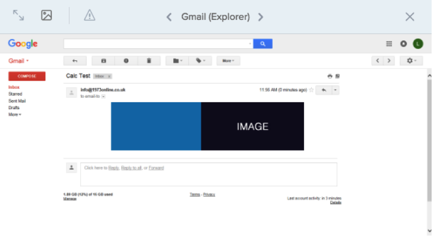
Putting calc() as the background position means that the background image will move as the template gets smaller. The percentage is the amount the background image will move with 0% being no movement and 100% being maximum movement. An example of this working can be seen below –
Desktop:
Mobile:
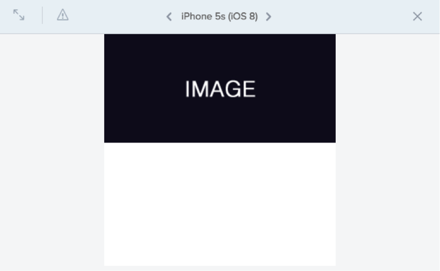
You can see that the image portion of the background image has moved to the right so that’s its viewable on mobile as well as desktop. We think this is a great styling tool to have and look forward to implementing it in future email builds.
Focus on Gmail before mobile
One final point about background images we wanted to talk about ties into the idea of building ‘mobile first’ emails. The premise of ‘mobile first’ templates is to build an email template with the Gmail App being the primarily supported client and then add in extras for other mobile clients and desktop clients. With this approach in mind any background images you want to incorporate into your email need to look good on the Gmail App and if they look good on the app they can be altered easily to look good on other devices and clients.
Summary
Background images seem to be an ever evolving tool in email and after the Litmus Conference we’re definitely looking at them in a different way. Having background images act as a wingman to your email rather than the main guy seems to be having some positive results. We’ve got a soft spot for background images at 1973 and are glad they are evolving along with email in general. We look forward to seeing how they’re used in future emails.