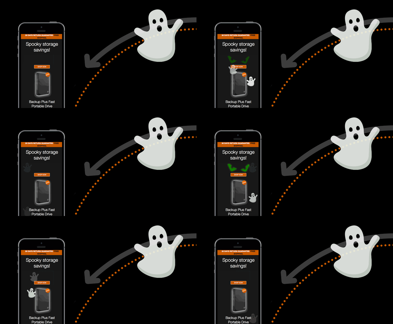
Building on our CSS3 animations, we recently made a Halloween email which featured a couple of (slightly) spooky ghosts and used CSS animations and media queries to move them in an arc, so I thought it’d be good to have a look over how it was done.
First of all, you can see the final email here. The ghosts needed to fade in (so they didn’t just appear suddenly), then move in a nice arc mirroring the static imagery behind, then disappear again. So to position them, we added a new cell to either side of the table holding the photo images, so they’d be positioned in the right place before they started their journey. We also made the ghosts a background which was only turned on if the media query that did the rest of the work, was supported.
We found that most email clients put the email in the centre of the page which left the email layout as it should be, however in Outlook.com the email was left aligned and the table with the ghosts stuck out to the right like a jenga block, but wrapping the whole thing in another table took care of that.

The code to position the ghosts looked like this:
.animated_leftghost, animated_rightghost { display:none !important; }
.animated_leftghost {
background:url(images/Ghost_leftSide.png);
display:block;
animation: leftghost 4s linear infinite;
animation-fill-mode: forwards;
-webkit-animation: leftghost 4s linear infinite;
-webkit-animation-fill-mode: forwards;
-moz-animation: leftghost 4s linear infinite;
-moz-animation-fill-mode: forwards;
}
.animated_rightghost {
background:url(images/Ghost_rightSide.png);
display:block;
animation: rightghost 6s linear infinite;
animation-fill-mode: forwards;
-webkit-animation: rightghost 6s linear infinite;
-webkit-animation-fill-mode: forwards;
-moz-animation: rightghost 6s linear infinite;
-moz-animation-fill-mode: forwards;
}
These styles also detailed the animation style and duration. In the table cells that held them, we have :
<span style="width:68px; height:73px;" class="leftghost animated_leftghost"></span>

    <span style="width:68px; height:73px;" class="rightghost animated_rightghost"></span>
The code that then moved the ghosts on their arc was :
@-moz-keyframes leftghost {

    	0% { -moz-transform: rotate(0deg) translateX(0) rotate(0deg); opacity: 0; }

    	50% { opacity:1;}

    	70% { opacity:0;}

    	100%{ -moz-transform: rotate(80deg) translateX(600px) rotate(-80deg); opacity:0; }

    }
@-webkit-keyframes leftghost {
0% { -webkit-transform: rotate(0deg) translateX(0) rotate(0deg); opacity: 0; }
50% { opacity:1;}
70% { opacity:0;}
100%{ -webkit-transform: rotate(80deg) translateX(600px) rotate(-80deg); opacity:0; }
}
@keyframes leftghost {
0% { transform: rotate(0deg) translateX(0) rotate(0deg); opacity: 0; }
50% { opacity:1;}
70% { opacity:0;}
100%{ transform: rotate(80deg) translateX(600px) rotate(-80deg); opacity:0; }
}
@-moz-keyframes rightghost {
0% { -moz-transform: rotate(0deg) translateX(0) rotate(0deg); opacity:0;}
50% { opacity:1;}
70% { opacity:0;}
100%{ -moz-transform: rotate(-80deg) translateX(-600px) rotate(80deg); opacity:0; }
}
@-webkit-keyframes rightghost {
0% { -webkit-transform: rotate(0deg) translateX(0) rotate(0deg); opacity:0;}
50% { opacity:1;}
70% { opacity:0;}
100%{ -webkit-transform: rotate(-80deg) translateX(-600px) rotate(80deg); opacity:0; }
}
@keyframes rightghost {
0% { transform: rotate(0deg) translateX(0) rotate(0deg); opacity:0;}
50% { opacity:1;}
70% { opacity:0;}
100%{ transform: rotate(-80deg) translateX(-600px) rotate(80deg); opacity:0; }
}
If we used translateX on its own the ghost would move in a straight line to the right 600px or the left -600px, but by adding rotate (80deg) and rotate (-80deg) it had the effect of keeping the ghost in a nice arc and the way that they counteracted one another stopped it actually rotating.
We thought it would be also be a nice to make sure they didn’t act symmetrically, so setting the timing slightly differently worked a treat, it was just changed to 4s duration against 6s.
Thats it really, it took a while because I couldn’t find much info about moving sprites on an arc, so hopefully this is helpful to someone!
