
If you’re involved in point-of-sale (POS) displays, this is for you. As you’ll be aware, they can be used to advertise a product or promotion in-store, and if designed effectively can drive sales and strengthen your brand.
To help you to create an even more engaging POS display that customers just can’t resist, here are our top tips:
1. Include dramatic imagery that commands attention
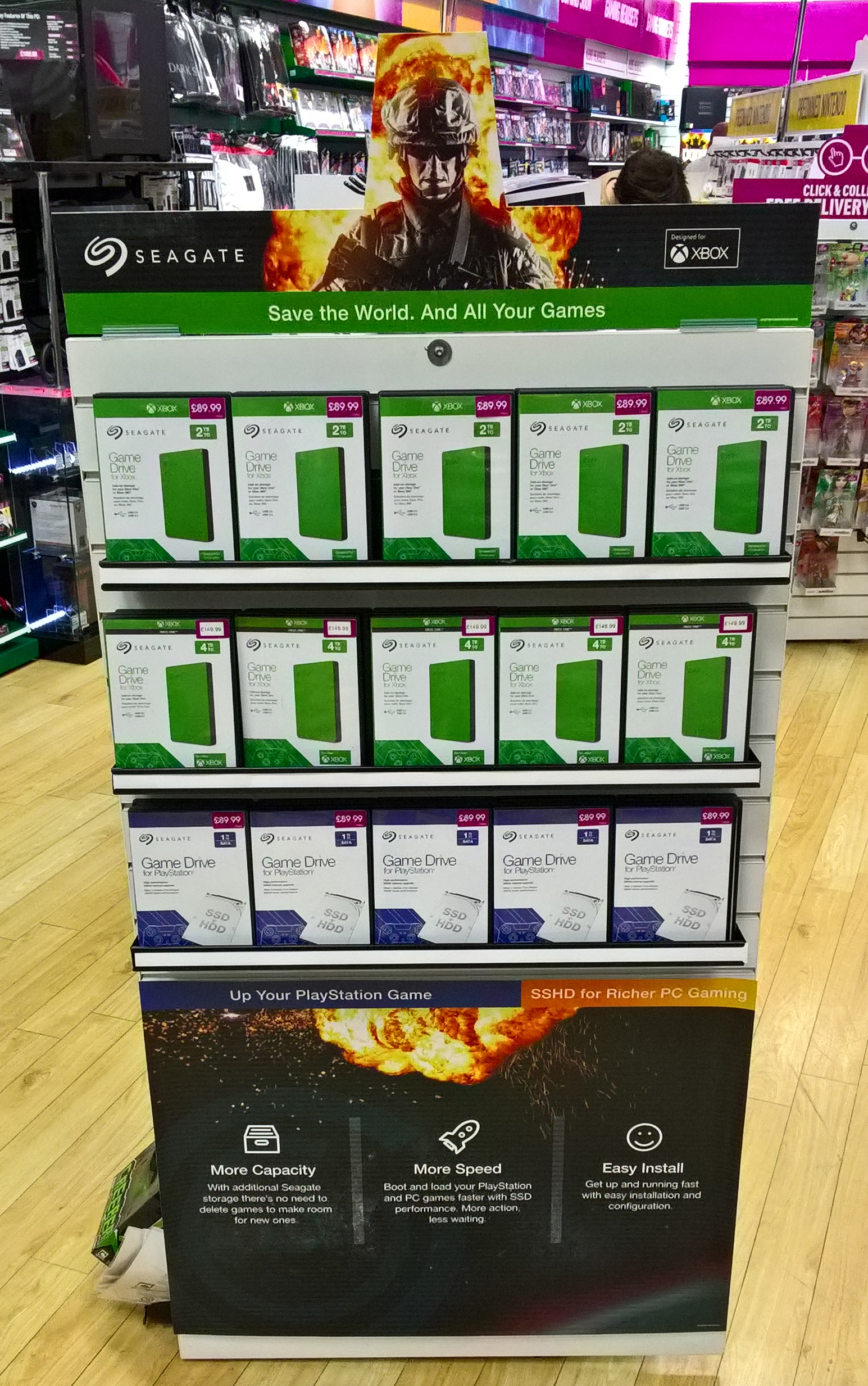
It is essential that your POS is eye-catching and stands out from the rest of the store. Use bold colours and interesting imagery that customers can’t ignore. Think about your font choice, and ensure it is bold enough to be clearly legible from a distance. The contrast between the white text and the dark background of this design works well in focusing the customers attention on the content. The explosive imagery of the soldier used here adds drama and interest.

2. Short and snappy content
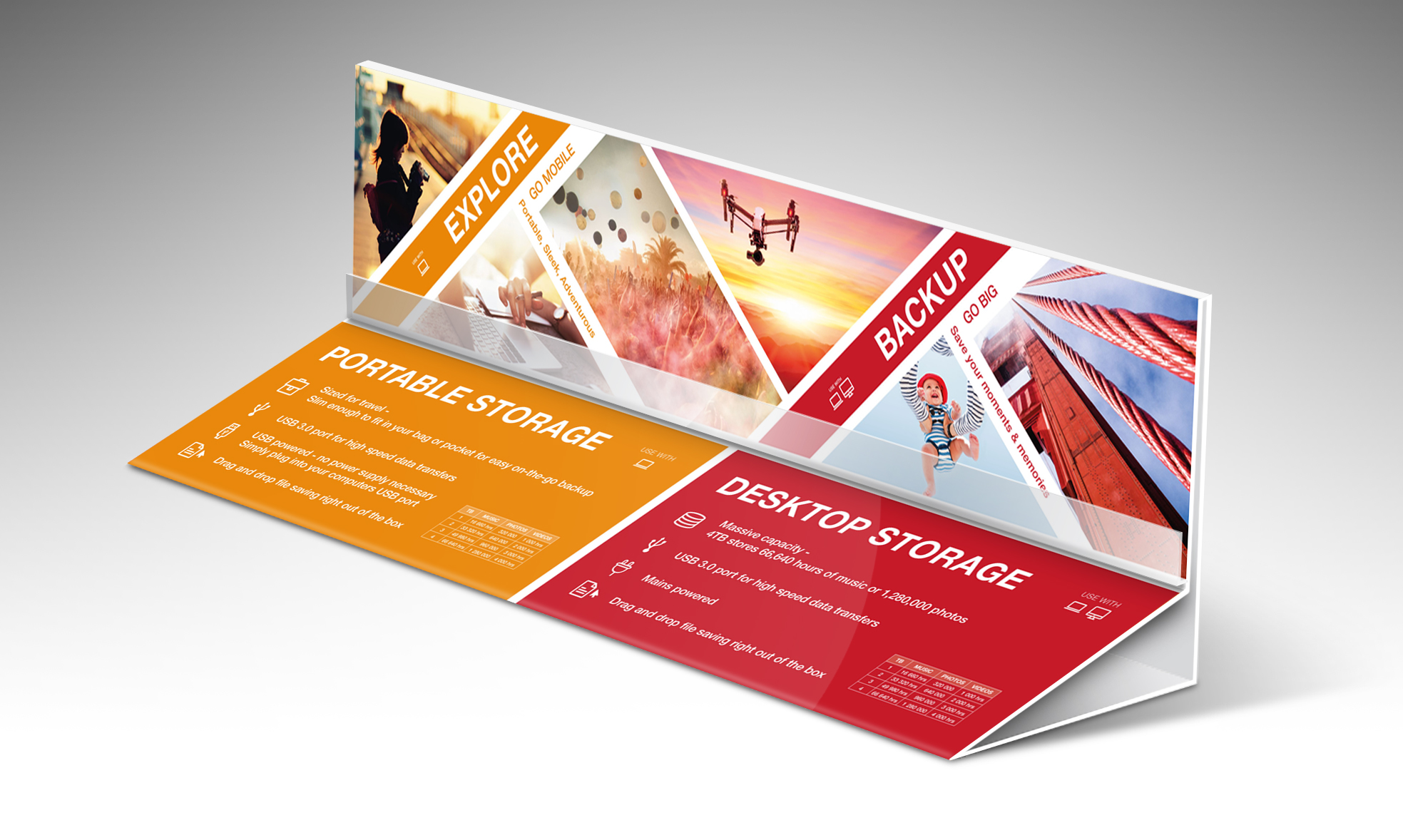
Keep copy to a minimum on your POS display. Customers want to know how your product will benefit them in a clear and concise way. Tables or bulleted lists are a great way of including key features without having to include lots of text. The example here also uses icons to draw the eye in and highlight each point.
3. Use photography with your target audience in mind
When using photography in your POS display make sure the models fit your customer base. Use photography that shows your products in action, in scenarios your customers can relate to. This example shows three products coupled with three photos of them in a working environment. This strengthens their usability to a customer.

4. Make it interactive
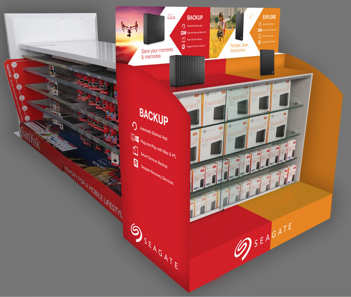
Include dummy products where possible so that customers can see exactly what you are offering. This will build confidence and encourage them to make a purchase. Fastening the dummy products to your POS with a retractable wire, allows customers to pick up the products and take a closer look, without being able to take them away.
5. Incorporate digital media
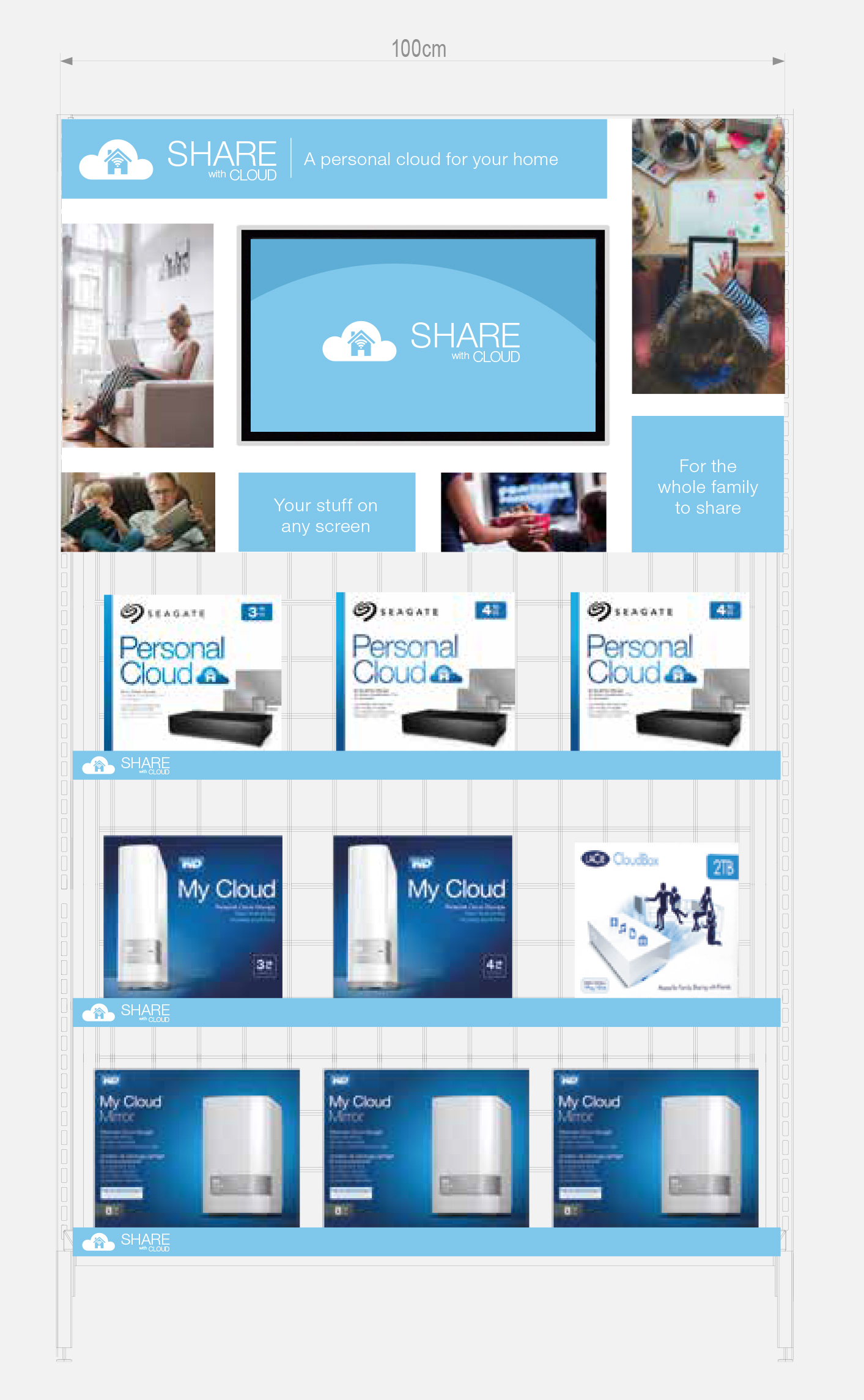
Include a screen in your POS design to play a video commercial detailing the products on sale. The movement of the video will attract the attention and interest of your customers. It can also be helpful if you have a lot of information you’d like to convey. As discussed in ‘tip 2’ you should keep your content to a minimum, however including a video in your display allows you to cycle through your messaging without it looking too cluttered.
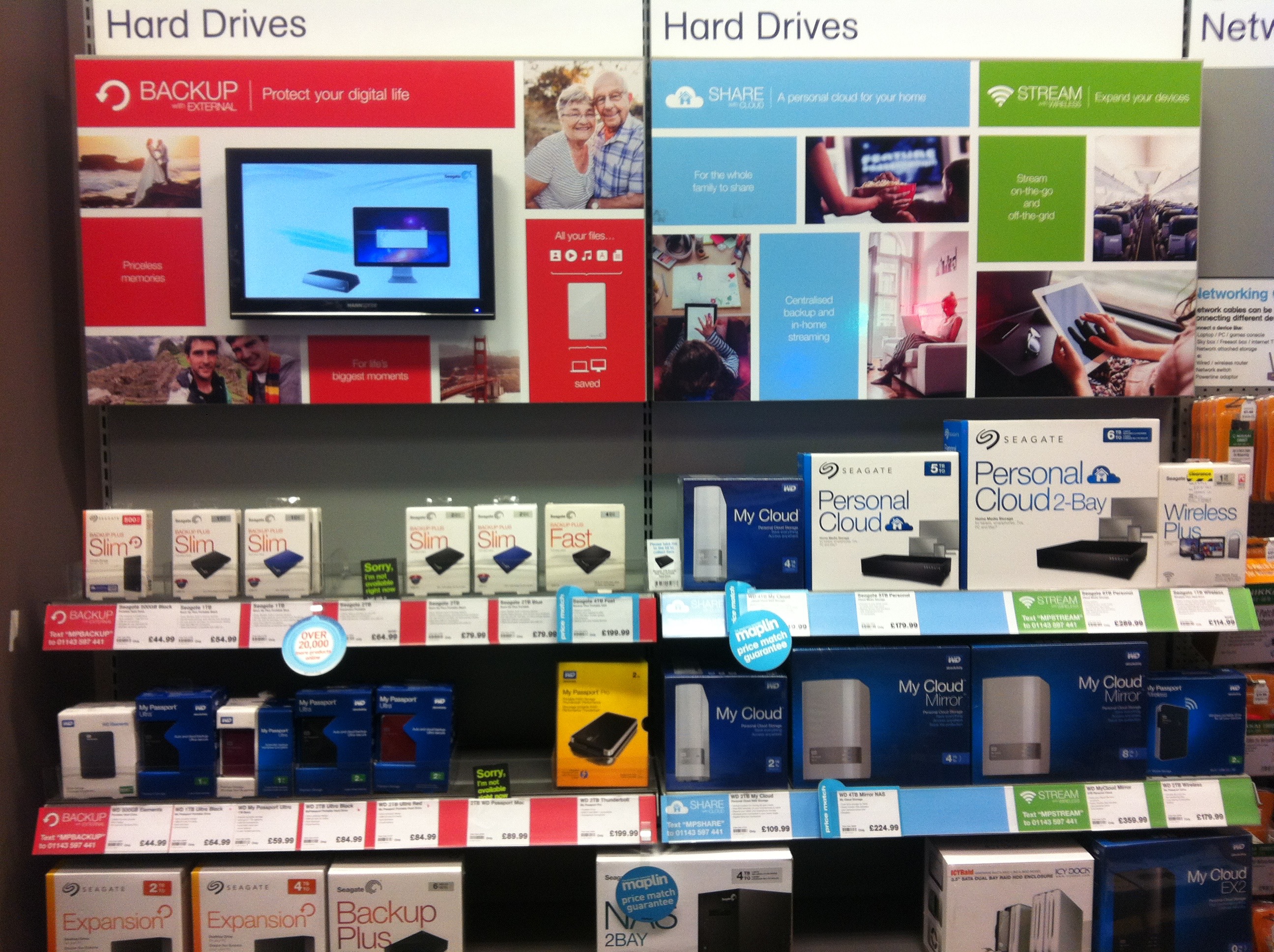
6. Utilise all of your space
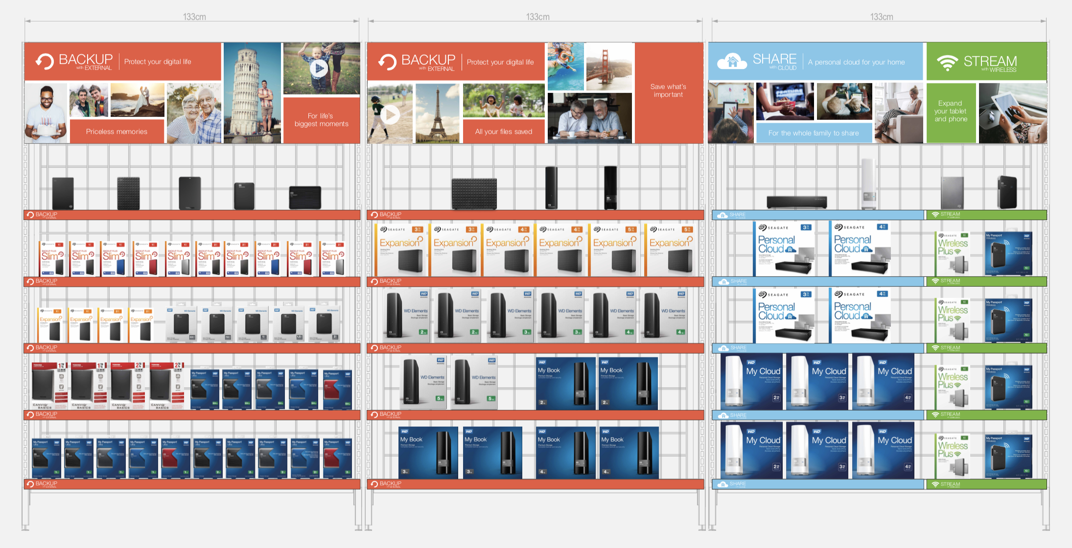
Getting a POS display in store can sometimes be a challenging process. So, when your design has been accepted, you should make the most of the space you are given. Instead of just designing the top panels on shelving displays, think about incorporating your branding in shelf strips and floor stickers to maximise the impact.
Want to see an increase in sales?
Incorporate these tips to create a more powerful and compelling POS display that will do just that!