Brainstorming our Christmas campaign last year we decided to take a slightly different approach to the usual multi-layered campaign in which we indulge in all our latest tricks! Thinking of the past year and the message we’d like to send, we felt clear it should be something meaningful and inspiring. A message of “togetherness” came to mind, and everything fell into place.
Christmas is a great time to reflect and come together, but it can be a tough time for some. We wanted to move away from the typical commercial, promotional stuff and create something that would hopefully inspire and help others. We chose to support Mind, a charity that is very close to many people’s hearts, embracing togetherness and empowering those experiencing mental health challenges.
The design concept
The best way to deliver our message? With the power of words! A thought-provoking statement treated with an eye-catching typographical approach seemed the best way to instantly and directly communicate the spirit of our idea. The words would immediately resonate, whilst the typography would deliver the personality and feeling, as well as encouraging sharability.
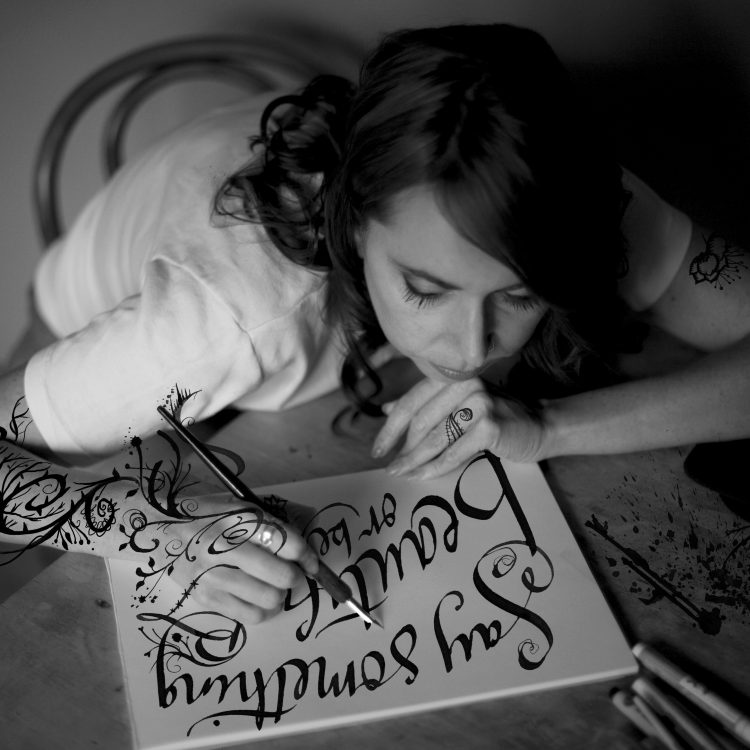
After a little research and a few mock-up ideas to visualise how it could work, we enlisted the help of an expert illustrator and typographer, Sarah Coleman from Inkymole. “Ink runs through my veins” says Sarah, whose stunning portfolio showcases her organic and enthusiastic penmanship. Luckily for us, Sarah is also a fan of Mind charity so was keen to be involved in our project, kindly reshuffling her hectic pre-Christmas schedule to accommodate us.


We asked Sarah to illustrate this rousing quote by Helen Keller “Alone we can do so little, together we can do so much”, which really captures the message we were trying to communicate as well as summarising the amazing work that Mind do. It needed to be designed for use across email and social media, and evoke the feeling of positivity in design as the words do.
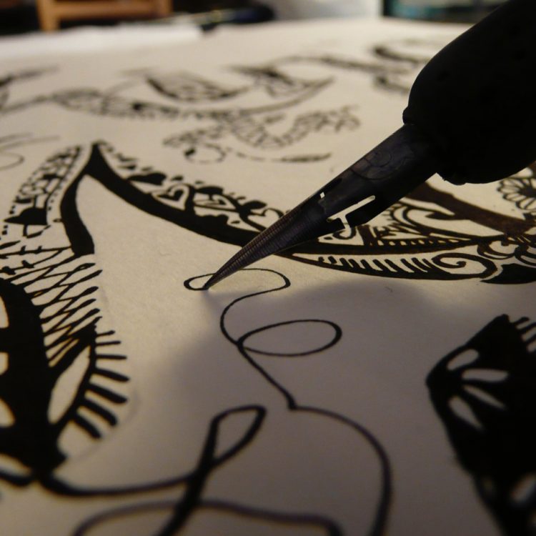
This video shows the various stages of the illustration process.
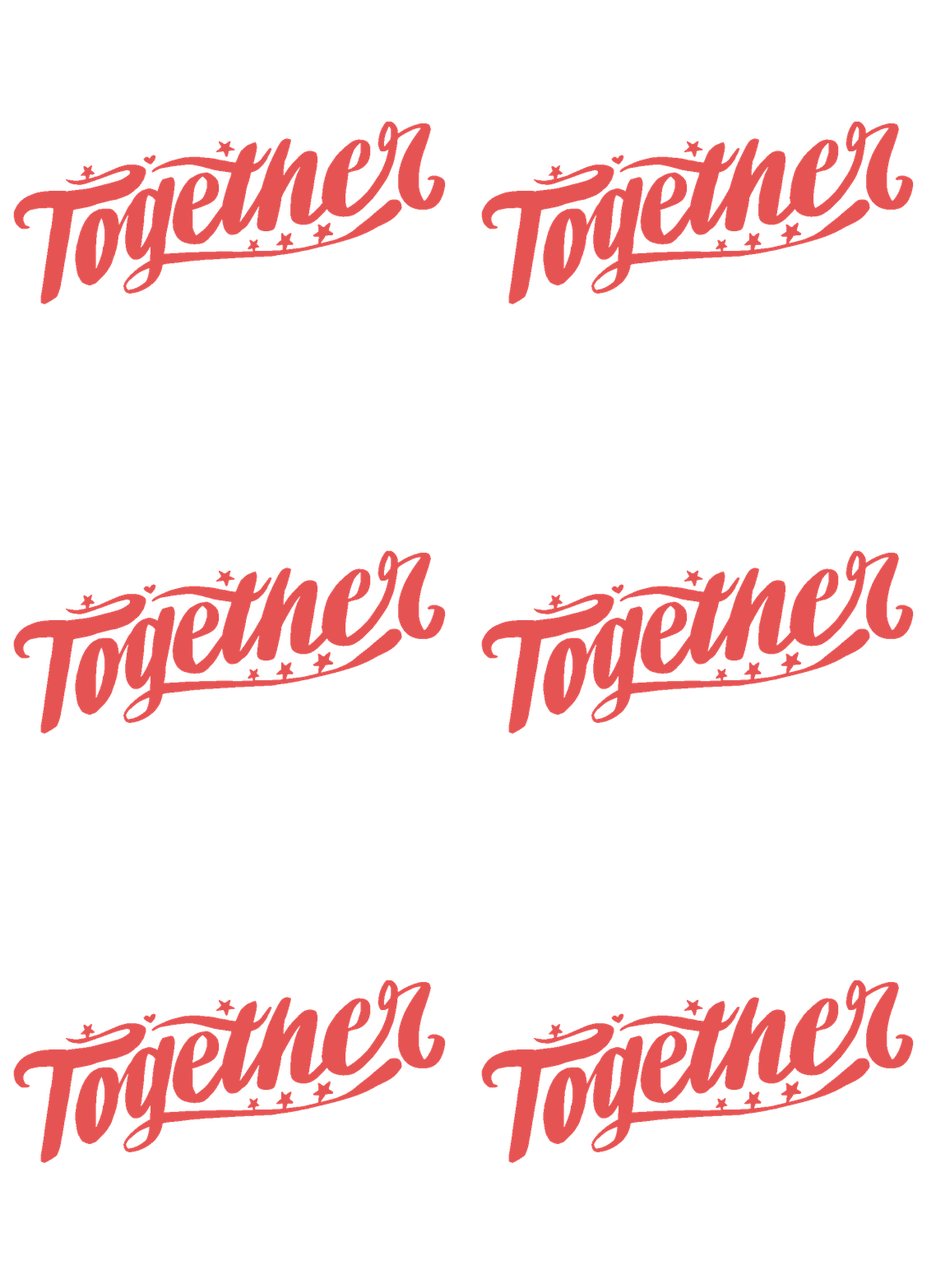
Once we had the black and white vector illustration, we applied our brand colours to bring it to life and draw focus to the word ‘together’. A little sparkle here and a twinkle there, movement was added through a gif animation – but only a little to catch your eye. Remember simplicity was key here as we didn’t want anything to get in the way of the core sentiment.
The end result!
We’re delighted with the end result and we hope you like it too. It captures everything we set out to do.
Well done @1973online on creating a purposeful Christmas email that’s not only beautifully designed but also isn’t just another airy fairy meaningless Christmas email from a brand.
Jaina Mistry, Litmus
If you would like to help make a difference please join us and make a donation.
Donate here
