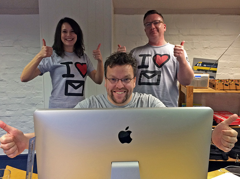
We recently completed our series of email marketing webinars, in conjunction with the Seagate Partner Program, in which we explored the basics and not so basics of email design, development and deployment. We were really pleased with the feedback we received and enjoyed answering partners questions in the final Q&A session.
SESSION 01 – Laying the groundwork
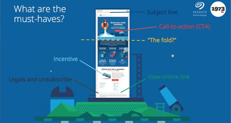
This session was all about laying foundations that ensure your email looks good, and has everything it needs, however it’s viewed. We used the webinar invite email to demonstrate the basics, from having a compelling subject line through to the necessary legal bits in the footer, and everything between.

SESSION 02 – Pushing the Boundaries!
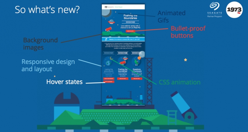
In the 2nd session we kicked things up a notch by exploring some of the cooler things possible in emails today and our predictions for tomorrow. From CSS animations and transitions, to fluid and spongy responsive layouts, emails are hot on the heels of the web in terms of what’s possible. In our webinar invite email we made sure to include a few bells and whistles that we could use to dissect and discuss with the recipients attending the webinar. We explored techniques that are still relatively new to the scene but robust enough for everyone to be using, such as animated gifs, hover states and background images, and then moved on to demo a couple of more out-there email techniques we’ve been looking at recently, such as shopping cart experiences and gaming within an email. With these however, it’s important to remember that not all email clients are quite there yet and so we also talked about fallbacks and graceful degradation. Because hey, with more and more email users choosing newer clients, why not give the good stuff to those that will see it?

SESSION 03 – Questions and Answers
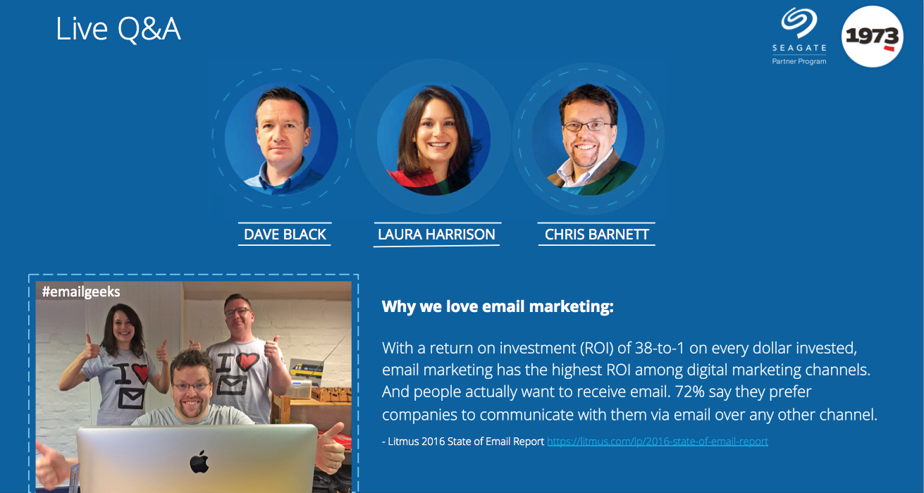
The 3rd session was given over to answering questions submitted during the first 2 webinars in more detail. These ranged from timing and frequency of sending an email, to the pros and cons of free vs paid for email services. Unfortunately the recording for this session failed, but you can download the slide deck to see how we tackled the questions in more detail.

We really enjoyed hosting these webinars, and learnt a thing or two ourselves along the way, so hopefully you will too! Download our webinars and the slide decks.
|
See what we had to say in SESSION 01 on the fundamentals of a good email template, where we dissect one of our own emails to show you how we tackle best practices such as styled alt tags, responsive layouts and subject lines. Check out SESSION 02 on pushing the boundaries of emails, where we look at CSS animation and interactivity in emails and show some demos of where we see email heading. Our final SESSION 03, Q & A, answered questions submitted during the first 2 sessions as well as taking live questions.
Please note : The prize draw mentioned in the webinars is for Seagate Partner Program members only who attended an entire live session and asked a question.


